ShopDreamUp AI ArtDreamUp

Deviation Actions


Suggested Deviants


Suggested Collections


You Might Like…


Featured in Groups


Description
Okay, it's been a while (i'm sorry) but i have been busy with work and vacation (Smile)") . I am going a little back to basics, since i want to learn new techniques and tools (and how to use them more efficient)
. I am going a little back to basics, since i want to learn new techniques and tools (and how to use them more efficient)
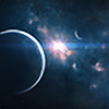
So this is it! It is wide to capture the vision of dawn (believe it or not, was hard on standard resolutions)
But here you can also use it for multiple display (if you really want :/)
Well, that was all for now, so hopefully i will see you all soon and i wish you all a happy summer.
So this is it! It is wide to capture the vision of dawn (believe it or not, was hard on standard resolutions)
But here you can also use it for multiple display (if you really want :/)
Well, that was all for now, so hopefully i will see you all soon and i wish you all a happy summer.
Image size
3840x1080px 2.03 MB
Comments35
Join the community to add your comment. Already a deviant? Log In
The overall piece, especially zoomed out, is fantastic. I pulled it up on my widescreen.
The first thing I notice on zooming in is the obvious loss in image quality. I can't fault you for the compression, especially at such a high resolution. But you can distinctly see changes in the colors as it avoids using a full palette in the compressed version.
That's more of a pet peeve than a critique, however. My suggestion might be to do a separate upload focused on the sunrise center. Even a small image with the right resolution would be fantastic.
Check out this video, and make sure to watch it in full 1080: [link]
Pause it right at 15 seconds and look at the difference. Now obviously being video you can still see pixelation around the sun itself, but overall being zoomed in that much more closely makes it a great picture.
The angle of the image also makes for a great image. Speaking of that comparison, unless this is a massive planet (Which with your work, it very well may be, and all the better for the universe, I say) for the clouds to look that flat you'd be at about the same level as that video I linked, so there'd be a bit more of a curve to the planet.
I'd say as far as learning and new techniques go, you're doing fantastic. But thus far, you've not reached the same level on these images as you produce with your standard space/nova/planetary compositions.
Still 1000x better than I can do, however. So good job! <img src="e.deviantart.net/emoticons/b/b…" width="15" height="15" alt="
Usually I have a section in here about how I think Vision, Originality, etc, are ridiculous ways of grading an image, but I don't feel like putting it in at this point. So here's a short version: I don't know what vision you were going for, and all your work is original. So 5/5 on both.
Technique, I docked you for the image conversion issues, because as a web designer, photographer, and amateur graphic artist it makes me twitch and gives me nightmares.
For impact, I think the picture is well composed, but would have been more impressive on scale with more curve, or a bit more crop.
Fantastic job, as always, and I can't wait to see more. <img src="e.deviantart.net/emoticons/b/b…" width="15" height="15" alt="