ShopDreamUp AI ArtDreamUp

Deviation Actions


Description
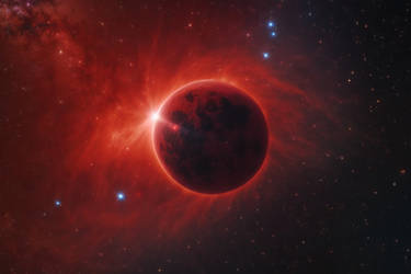
The Rift in 2560 x 1600
Enjoy!
Enjoy!
Image size
2560x1600px 3.77 MB
Comments30
Join the community to add your comment. Already a deviant? Log In
Disclaimer: Since I never know exactly what an artist is attempting to achieve with any particular image, I critique based on what I believe are the five most easily identifiable elements.
These are always going to be subjective, as art always is in all forms. Some things I will like, some things I will not. I will give a generalized impression of the image at the end.
Effort: After making a similar image myself, I can fully appreciate the effort put into each of these shots - Even if the process itself is standardized, I understand the time and patience it's taken you to polish your work to such a degree it's worth publishing. You've done so many of these types of shots and it seems that this in itself is a niche style because of how well and how specifically you do it.
Color: Your work always seems colored in such a way that it passes along the vastness and silence of space - Dark edges, bright focal points, and those clouds! I'd love a tutorial on just the clouds alone - They are spectacular every time. Now I've seen pieces of yours with more color than this piece, which is almost monochomatic, but they're always done spectacularly.
Positioning and Composition: The way the clouds envelope the sides of the piece, and the positioning of the planet in an off center position greatly achieves a rift-like effect. Even if it's hard to discern if there is an actual rift, the light coming through just on the edge of a dark planet enhances the piece - Maybe that's just my subjective love of sunrises from space, but either way I like it.
Focus and Path: Dark edges, light center, with a flare effect and the darkness of the planetoid to help balance the piece on the left side as the clouds dip create a very symetrical and asymetrical piece at the same time.Of course the flare is the focal point no matter how I look at the piece, but covering the flare with a finger I'm drawn to the edges of the clouds that are highlighted and the way they seem to frame the inside of the piece - It's almost like you did several pieces and as I cut out each focal point I'm drawn to something entirely different on the image.
Lighting: I know I had a lot to say about your piece a week or so ago - Lighting in this piece looks simple, but the fact is even if it was a simple piece to light, it was done perfectly. As I said before I do more photography than most anything else, so I notice issues more than some might as far as lighting goes. And I have to say this piece passes my eye amazingly well.
Impression as a whole: It was nearly impossible to write each section without mentioning pieces from other sections - To me that's the sign of a great piece. Everything was tied together - You used lighting to affect your color, positioning and composition to affect your focus, and lighting to affect your focus as well. A lot of pictures are easy to do because you'll have an obvious bit driving each part. Now I know with space pictures, there's always similar elements in play, and that most people won't compose a picture thinking of anything other than how awesome it looks. But you could easily get by saying "Oh yeah, I meant to do that" because to me it looks like you did.
Lastly, as far as my ratings: I hate the rating system in that it only has four items in it. I always give originality full marks. Every picture, even if it is an outright copy of someone else's style, is still unique. No one else has created that picture. No one else has that exact way of doing things. To me vision is more something you should be grading. Did you achieve your goal, your vision that you had in mind when you created the image?
Ratings:
With photography it's hard to do ratings, this is a bit easier.
Vision: I will give full marks here because it's your vision that matters, not how I see it. Did you accomplish your goal? I assume you did else you'd not have published it, so full marks.
Originality: You do a lot of the same thing, but you do it well. Your tutorial and technique are similar across the board but every piece you attempt to do something different, whether it's impacts, or just giving a specific impression. I'm tossing a four in here just because of the fact that they do all use the same methods in varying degrees. - Though for a space picture, with the amount of them out there on DA, to me a four is a high mark.
Your technique is close to a science - I tried it myself and just couldn't pull it off, so I had to change the method and simplify it for my own needs. As I've said before, to be great is to be copied, and I couldn't even copy your technique. It's obvious you've been doing it for a while (Duh, look at your gallery) so full marks here.
Lastly, impact to me is close to vision. It's more subjective to the viewer than the artist, but I have no way of knowing how you want the picture to impact me. So I'll go by title.
The piece was titled "The Rift", and the way the focal points and lighting ties everything together, I am drawn to the split in the clouds where the light pours through, unless that's just superheated cloud itself - Hard to tell in space - I don't get the impression of a rift, or any destructive force present. To me it's just a very serene. So I'm putting a three for Impact because it's not negatively influencing me, but I have to use my imagination to draw a correlation between title and picture.
I hope this is helpful! I'd love to have a response!